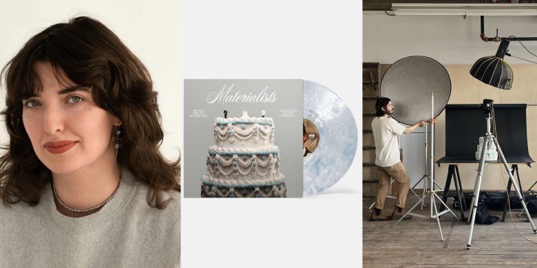
When Celine Song and A24’s summer rom-com Materialists needed a vinyl release that felt as layered, playful, and bittersweet as the film itself, Providence-based graphic designer Elizabeth Goodspeed stepped up to the turntable. With a love for blending historical research with tactile, hands-on craft, Elizabeth approached her first-ever vinyl project with the same cinematic sensibility as the movie, treating the design not as packaging, but as storytelling.
From commissioning a custom wedding cake (complete with miniature love-triangle toppers) to threading in subtle nods to the film’s themes of love and money, her process was as meticulous as it was imaginative. In this conversation, she takes us inside the whirlwind design process, the unexpected challenges of cropping actors’ faces onto round labels, and the joy of finding the perfect champagne-silver hue.
Tell us a little bit about yourself:
I’m a graphic designer and writer based in Providence who works across branding, print, and editorial projects. I have a particular love for anything that involves historical reference or physical media! My work often blends research with hands-on experimentation, whether that means digging through archives for visual inspiration or building custom props for a photoshoot. This was my first time making a vinyl record, but I love working in media so I was super excited about it. The fact that it was a vinyl for a film was especially fun, as I’m a huge film buff. Overall I’d say I’m particularly drawn to projects—like Materialists—that treat design as part of the storytelling, not just a wrapper, which this was in spades.
Can you walk us through your creative process for the Materialists artwork, from concept to final design?
It was a fast turnaround, so the concept had to come together pretty quickly. The materials I was given from A24 were a bit mismatched—lots of photos of some actors, very few of others, and an uneven mix of BTS and in-costume actors. I landed early on the idea of a wedding cake (actually inspired by an old poster about Beethoven’s birthday which used a cake), which felt like the clearest cultural touchpoint for the film’s matchmaking world and the way most rom-coms end with a wedding. I briefly explored other possibilities of romantic props that show up in the film—like a huge bouquet or heart-shaped balloons—but a good old fashioned wedding cake felt too iconic to ignore!


I really wanted the cake to be a real cake that I actually photographed rather than a stock image. I live in Providence, RI, and while I thought about going to New York to shoot the cake, since most of my photography, food and prop styling connections are there, I didn’t have time in the window allotted. I ended up asking the pastry chef, Millie Joslyn, at one of my favourite local restaurants, and then finding a great photography duo based out of Rhode Island, Apparition, to work with me, and they ended up pulling things together really quickly for me.

Initially, I didn’t plan to put the three figures on top of the cake for the cover photo—I thought it would be better to just have the title in frosting on top. I’d bought them on eBay as a backup, and when they arrived, they were hilariously small, so I assumed they wouldn’t work. But on set I tried them out and I ended up loving the visual contrast of tiny figures on a big cake. It was also a simple way to represent the love triangle (though I did worry it might read as a polycule!) I wanted the tone of the photo to carry some moodiness; while the film is positioned as a rom-com, it also deals with heavier themes, so it couldn’t feel too breezy. We tried some fun stuff with sparklers too, which nicely matched the warm yellow in the wedding scene in the film, but I ended up finding them a bit off in tone.
I always knew I wanted the photo of Dakota and Chris in the middle gatefold. I knew I wanted at least one film still, and it fit so nicely into that space. For the record liners, I wanted to balance out all the photography with something illustrative, so I played up the idea of duality with the illustration of the rose and the diamond to represent the theme of love vs. money that shows up throughout the film.


I presented two options, the one that was chosen, as well as an alternate idea that didn’t use any original photography, leaning instead on illustrations and BTS cast photos. It wasn’t chosen, but I still have a soft spot for the heart-shaped A- and B-side graphics (plus the pops of blue). The cake direction was approved almost exactly as pitched for the cover—just a few tweaks to the typography—while the back shifted a bit, from a film still of Dakota’s hand with a flower ring to a fun BTS photo of the cast.
How did the film and soundtrack influence your visual choices?
The film is visually rich, but much of it is “people in dark rooms talking”—beautiful on screen, but not necessarily dynamic for an album cover. From the start, I knew I wanted to focus on a single graphic image that could represent the film’s ideas, rather than relying on screenshots.
The love triangle—choosing between two men—felt like a natural fit for the built-in duality of the format: front/back, Side A/Side B, etc. For the record label, I experimented with using those more symbolic dual motifs, like a flower on one side and a diamond on the other to represent how each man expressed love, but eventually decided to just give people the leads’ faces (the people want Pedro Pascal!)


The soundtrack is moody and romantic, so I leaned into visuals that felt classic and grand rather than punchy or overly trendy. I basically wanted to get right up to the edge of pastiche without crossing it.
Some motifs from the film made their way into the design, like the blue of Dakota’s dress, which was also in the original poster. I tried versions where that blue was more prominent, like using it as the record color, but ultimately we kept it subtle—it’s now most notably in the icing of the cake I had made for the cover. When I briefed my pastry chef on the cake, I also asked her to put some flowers on it, which you can see dotting the cake throughout (a bit of an easter egg).
I went back and forth on the cover color. That same blue as Dakota’s dress felt too contemporary and bold, and gold was too splashy. I originally picked black, but it ended up feeling too somber. The champagne silver we landed on ended up striking the best balance: elegant but still punchy. Plus, I never get to use metallic Pantones since you usually need such a big print run! I echoed that tone in the vinyl itself, which is a milky metallic with soft blue streaks.


“Designing a soundtrack is different from designing for a typical album. The art becomes more about sparking memory—cueing certain themes, moods, or visuals so the listener is pulled back into that world. It’s less about setting the stage and more about re-opening the door.”
How does designing for vinyl differ from other physical formats or creative projects you’ve worked on?
Vinyl comes with a lot of different parts, each with their own constraints and affordances, so you have to think about how an idea will carry across the whole set. When I’m working I’ll often test an idea for an image or motif in a different contexts to see where it fits most naturally: should the actors’ faces live on opposite sides of the record liner with no holes, or with cutouts that reveal a flower motif underneath? If the faces move to the records themselves, how can the sleeves still tie into that theme? How the hell do I crop them on a circle and have them look similar in size even though the two photos are radically different? It’s definitely a balancing act of varying the colour, type, and imagery throughout enough to add intrigue while still keeping it cohesive as a set.
There’s a ritualistic, tactile quality to vinyl that other formats don’t quite have. It’s something people keep and handle repeatedly, unlike consumer goods packaging that’s discarded immediately, or a book cover that’s rarely examined closely. I like trying to find ways to reward repeated interaction with subtle details: things like a tiny ligature in a credit or a small heart instead of a bullet on the spine.
What role do you think album art plays in shaping a listener’s experience of a soundtrack?
Designing a soundtrack is different from designing for a typical album. An album cover primes you for what you’re about to hear; a soundtrack is usually something you return to after you’ve already seen the film. In that case, the art becomes more about sparking memory—cueing certain themes, moods, or visuals so the listener is pulled back into that world. It’s less about setting the stage and more about re-opening the door.
What’s your favourite piece of album art and why?
Too many to count! While working on this, I kept thinking about the Rolling Stones’ Let It Bleed (cake on record covers: never a bad idea). I’ve always had a soft spot for food-themed artwork, like One Night with Blue Note (which I discovered through Rachel Cabitt’s “The Art of Cover Art” newsletter). I also really love Donovan’s record covers (Donovan – Sunshine Superman was one of the first records I bought) and the psychedelic text and framing he uses.
My favourite in my own collection is probably something I found at a flea market but have never been able to locate online. It’s a compilation of sad songs called Crying Time, I think from the 70s or 80s. The cover is a super-close-up of a girl hugging a boy, shot almost over his shoulder, with one perfect, glossy tear sliding down her cheek. Gets me every time!
Explore more of Elizabeth’s work on her website, and on Instagram.


